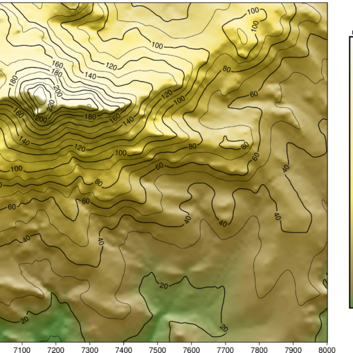
InfluxDB and Grafana are designed for storage and display of one-dimensional time series data. There is however an XY Chart option in Grafana that also makes it possible to show two-dimensional data. There are several challenges however:
- InfluxDB returns multiple measurements (the x and y values) as multiple rows, even if they were imported as a single row.
- The various points will be separate data entries that have to be combined into one table based upon timestamp.
- There might be multiple epochs in the chosen time range
All of these can be tackled with features of the Flux language:
- pivot turns rows into columns
- group groups entries by timestamp
- last selects the last epoch
Here’s the full code:
from(bucket: "bucketname")

|> range(start: v.timeRangeStart, stop:v.timeRangeStop)

|> filter(fn: (r) => r["_measurement"] == "measurement")

|> last()

|> pivot(rowKey:["_time"], columnKey: ["_field"], valueColumn: "_value")

|> group()


